Fann Grotesque; From a Street Near You
Process
The initial catalyst for the design of Fann Grotesque came from our custom commissions, where we had explored the same genre for a typeface for The Old War Office * (with Greenspace, 2018). The typeface for OWO took inspiration from the eccentricity of Engravers Gothic (1906), turn of the century metal type, literature from WW2 and London Ghost Sign; all felt relevant to take these learnings into the Fann Grotesque project.
Our initial research led to a specimen produced by the Fann Street Foundry held at St. Brides, London. The Fann Street Foundry stood on its site in Fann Street, London EC1, from 1802. The originator of Clarendon (1845), the foundry provided a plethora of metal typefaces for use in a wide range of applications. Fast-forwarding to the modern day, Fann Street, London is now a side street, linked to the Barbican Estate. One of the UKs most iconic piece of Brutalist architecture.
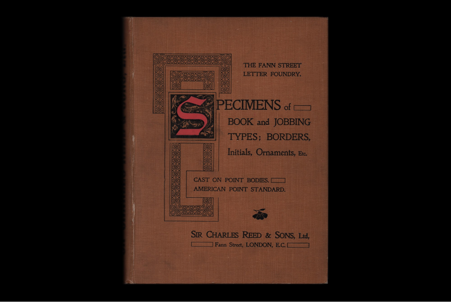
⁕ Cover of the Fann Street Foundry Specimen from and with thanks to St Brides Library, London
The specific reference from the Fann Street Foundry Specimen included a set of ‘floral’ italics that we decided to start the design process with. Italics are usually designed in succession to the roman styles however our approach to Fann was somewhat left field — as it is the italics that drove and dictated the overarching direction of the family.
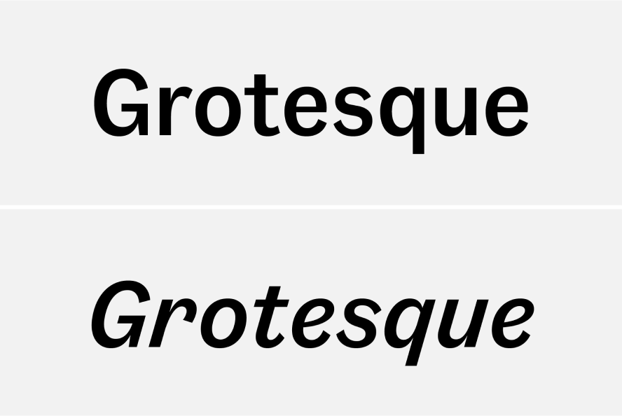
⁕ Fann Regular showing contrast between Proportional & Italics — Top: Fann Grotesque Regular / Bottom: Fann Grotesque Regular Italic
Generally, the approaches for drawing italics for a type family, can be split into two distinct approaches:
A) Obliques; slanted versions of the upright styles with minor optical adjustments.
B) True Italics; separate designs that are complementary to the upright styles and can sometimes reference cursive style.
To give definition, we opted to give Fann Grotesque further dynamic by offering true italics. For a sans serif design, unusually cursive inspired Italics were chosen.
By no means a revival Fann Grotesque becoming its own entity, where, we used the notion of The Fann Street Letter Foundries’ intriguing ideas as a catalyst to develop our own designs. The calligraphic forms combined with the extreme 16° angle create a dramatically different texture to the upright styles, contrary to the option of subtle obliques.
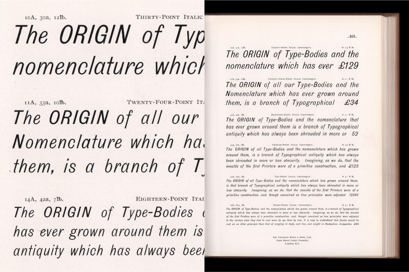
⁕ Original reference of Fann Grotesque Italics from and with thanks to St Brides Library, London
It’s sometimes difficult to grasp the true intentions of the letter cutter when looking at printed wood or metal type. The cutting can be inconsistent, along with a variety of other variables (printing, ink etc), with gestures differing dramatically from form to form. For example, if we were to take all of the lower case ‘e’s from one page of text — there could be several different designs amongst the same face.
Our initial explorations in the Regular weight of the italics and were far more expressive than the final outcome — exploring some of the more nuanced gestures that were visible in The Fann Street Foundry’s specimens, such as the ‘overbiting’ stroke terminals. Ideas such as this were generally successful in the Regular weight, however, we began to run into problems when developing some of the more ornate forms in the bolder weights. We eventually made the decision to tone down some of the idiosyncrasies — a compromise which allowed the whole family to be more succinct, and allow a smooth transition between weights and styles. There were however, some gestures in the lighter weights which we were too fond of to let go, so there are a number of forms changes, such as the ‘f’ changing from a long tailed variant in the Light weights, to a baseline-sitting form in the Black Italic.
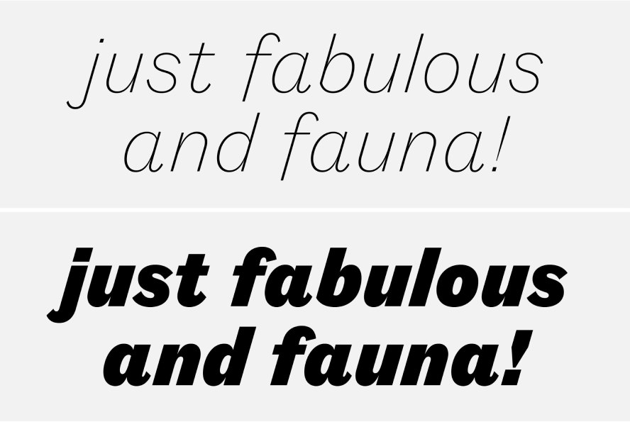
⁕ Comparison of the extremes of the Italics of Fann Grotesque — Top: Fann Grotesque ExtraLight Italic / Bottom: Fann Grotesque Black Italic
Fann Grotesque’s upright styles do not adhere to any particular historical design — instead aiming to capture the broader spirit of the 19th century British Grotesque type genre, exploring its eccentricities and imperfections. The designs draw inspiration from a number of British type foundries including Stephenson Blake, Day & Collins and Miller & Richard — whose specimens we were fortunate enough to examine at the magnificent St Bride Library in London.
We were conscious whilst designing the upright styles to strike a balance between a hardworking functional typeface and capturing the naive confidence of the 19th century sans we love so much. The forms are less expressive than the italics, however the more subtle details such as asymmetrical arcs and high stroke contrast are still present, giving Fann an audacious personality.
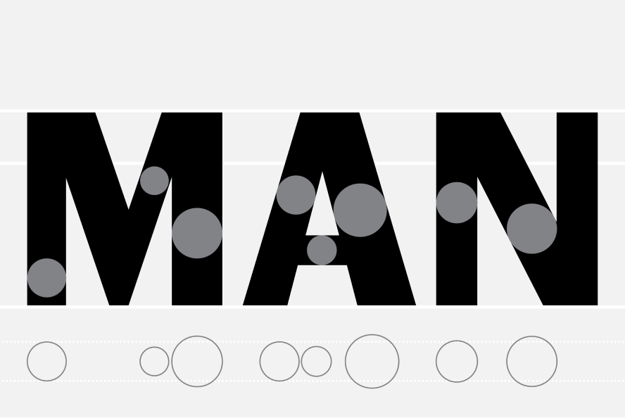
⁕ Contrasting stroke widths are utilised through Fann Grotesque — Left: Fann Grotesque Bold
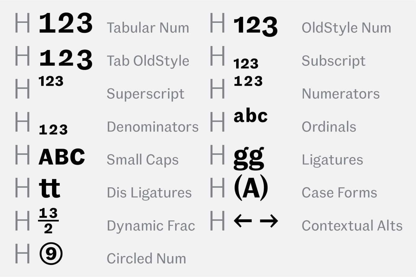
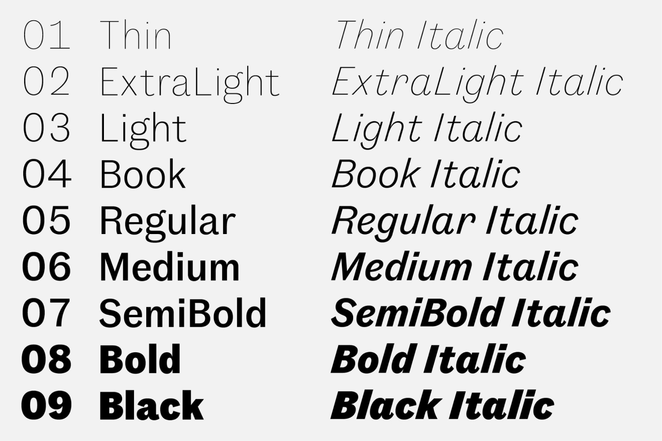
Fann Grotesque aims to offer itself as a positively outlandish alternative to its contemporaries, celebrating some of the more peculiar traits found in the 19th and 20th century. It is available in 9 weights — Thin, ExtraLight, Book, Regular, Medium, SemiBold, Bold and Black — all with corresponding true italics. It can be licensed as either Standard (‘STD’) or Professional (‘PRO’), the latter containing a range of additional OpenType features such as Small Capitals, Nut Fractions, Ordinals and alternative figure sets.
-> View and explore Fann Grotesque
* The Old War Office is a former government office building with 1,100 rooms used by Churchill as a headquarters during World War II. It is currently being converted into a luxury hotel and private residential apartments.
