
H&M Move
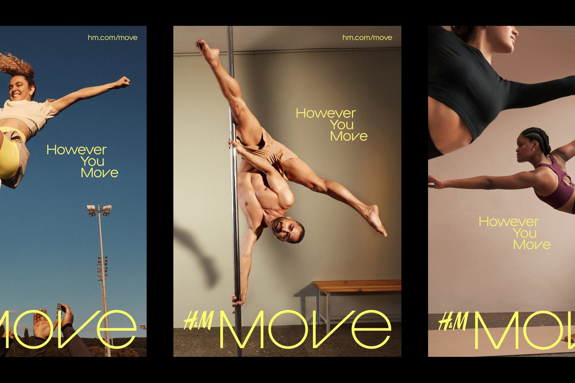
Launched globally on the 4th August 2022, H&M Move is major fashion retailer H&M’s extension into activewear, specifically designed to democratise the sportswear category by re-defining sports activity as movement.
- Typeface
- Move Sans
- Comissioner
- GentleForces
- Year
- 2022
- Styles
- 6 Weights —Thin, Light, Regular, Medium, Bold, ExtraBold Plus corresponding italics
- Coverage
- Adobe Latin 2
- Classification
- Sans Serif Display
- URL
- hm.com
- gentleforces.com
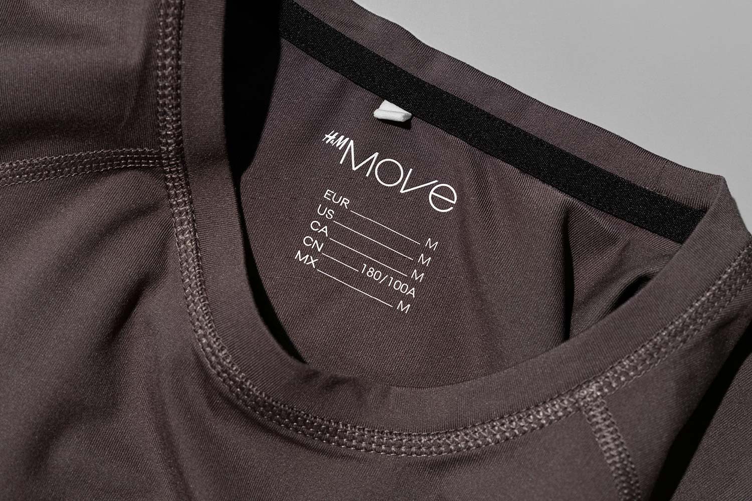
Working closely with design agency GentleForces, who collaboratively devised the vision, brand strategy, name, tagline and logo for the new brand, the “HM Move” typeface consists of six Weights, all with corresponding Italics, in both Latin and Cyrillic character sets.
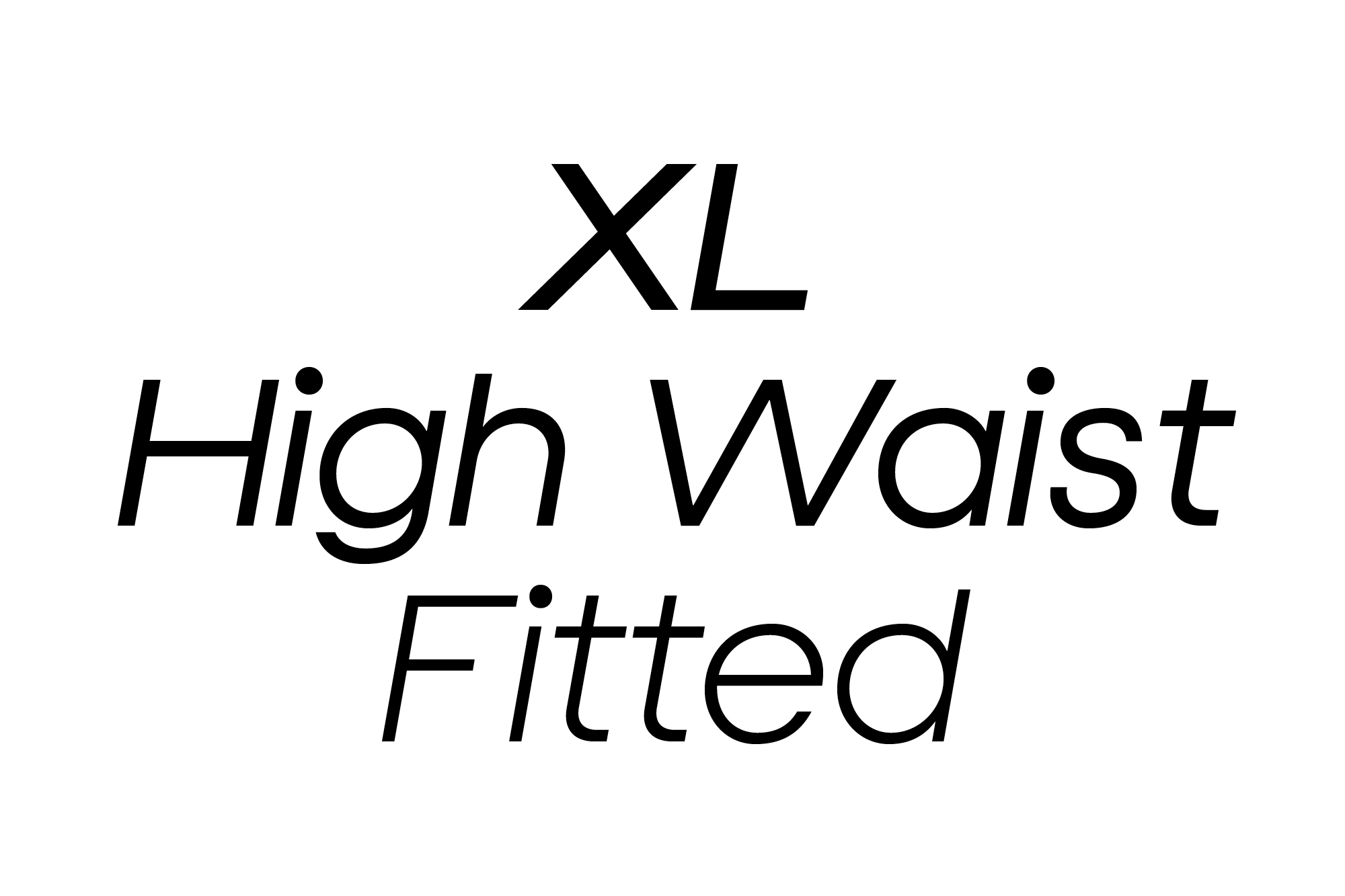
The design DNA was based around a new graphic device created by GenteForces for H&M Move. In it, the letters of the word “MOVE” are rearranged and obliquely referenced through the geometric forms of a vertical triangle inside a square, a circle, a slanted triangle inside a square and another circular outline.
The central branding message of the launch — the democratisation of sport — is reflected through the uniquely balanced design features. Geometric forms are fundamental in establishing the look and feel of the typeface, which is characterised by a consistency of line and shape. The spacing of the uppercase letters is heavily influenced by monospaced type whereby each character keeps to the same bounding box, and the monolinear weighting throughout creates a neutral sense of equilibrium.
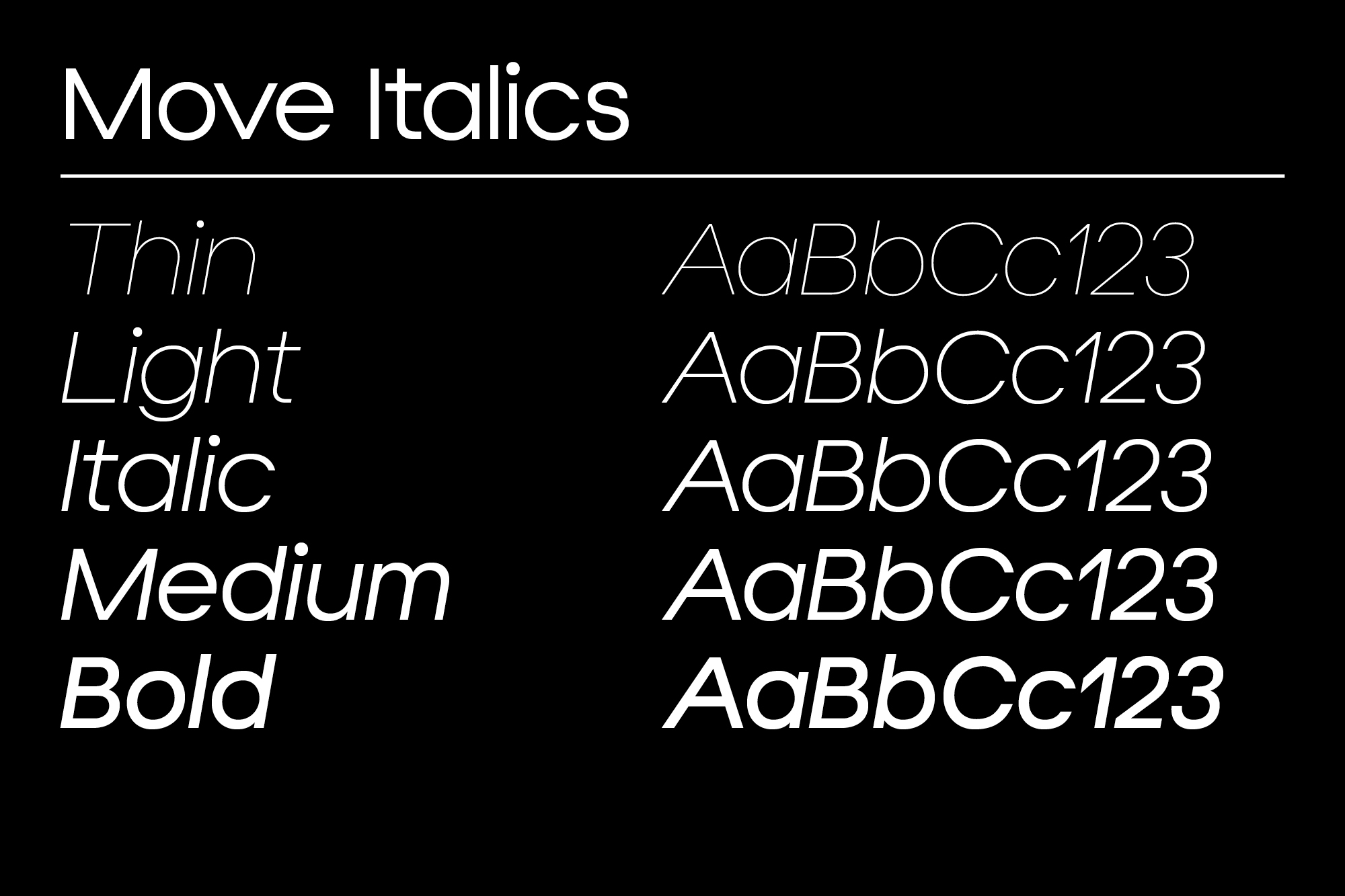
There is a distinct and purposeful uniformity across forms, for example the «C» is cut straight out of the «O». The uppercase character set contains a consistent running line in the horizontal point across the characters « B E F G H K P R » to give the impression of balance, with closed, perpendicular terminals used to further accent this midline.
This is interspersed with moments of motion articulated through a selection of slanted characters (« A V W v w y »). Further unique forms, such as the «8» and «&», have a sense of movement and direction of travel that at once complements and juxtaposes the balanced aesthetic.
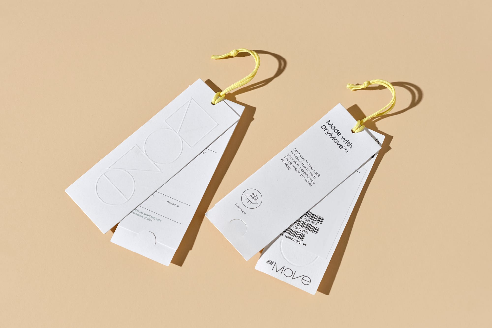
The first collection of Move Essentials, made with 85% recycled or sustainably sourced materials, launched in 2500 stores worldwide. The collection was accompanied by a global workout campaign directed by Loren Danis at Rattling Stick and featuring fitness icon Jane Fonda and choreographer JaQuel Knight.
With thanks to GentleForces for the images.
Recent Custom Projects
View all

