Pets at Home Headline
Led by Nomad Studio, the well-established British petcare provider Pets at Home undertook a rebrand that would unite their disparate brand packages into the singular, unified voice of ‘Pets’, requiring a flexible design system that would work for all brands, across all touchpoints.
- Typeface
- Pets Headline
- Comissioner
- Nomad Studio
- Year
- 2023
- Styles
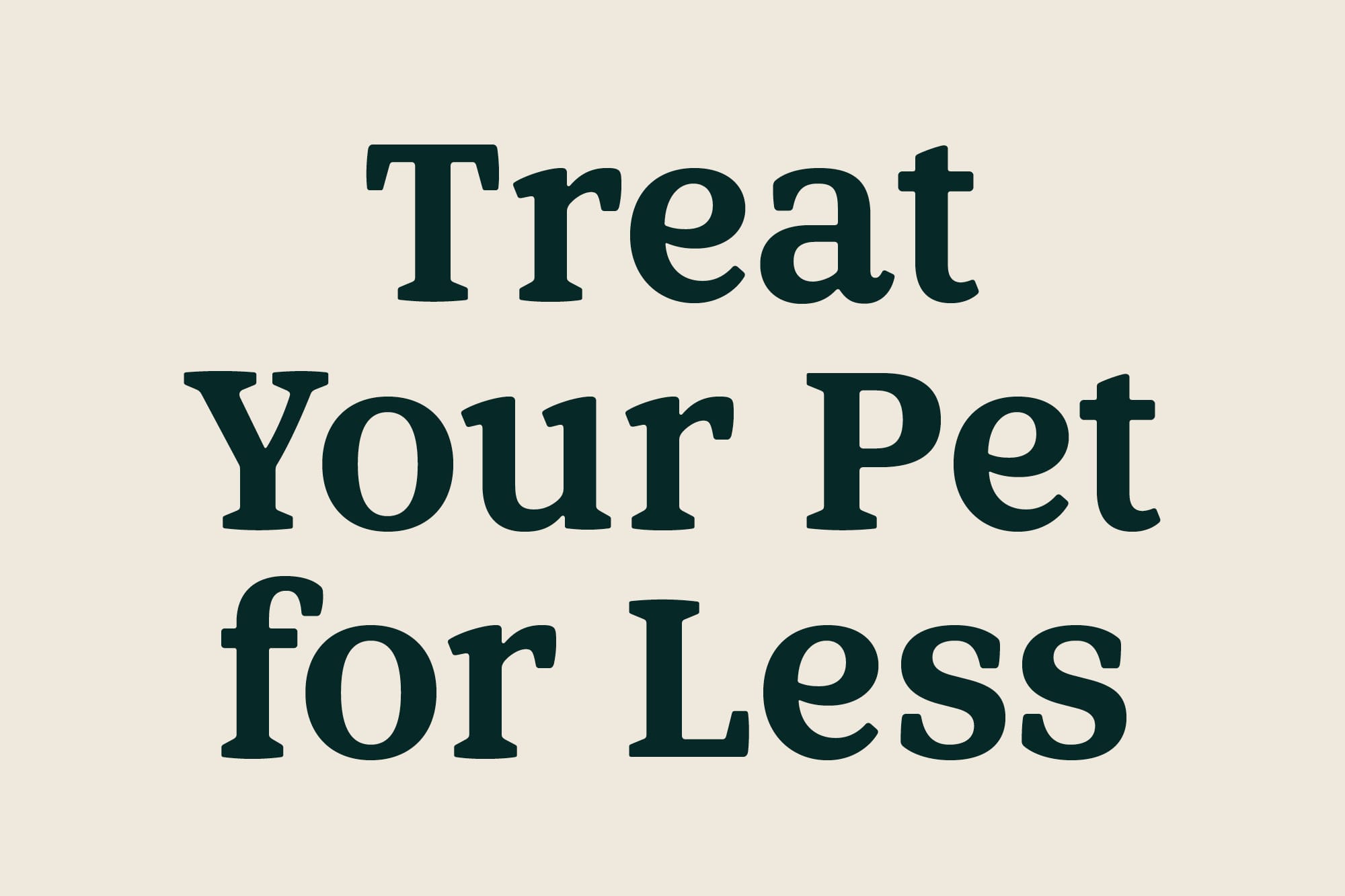
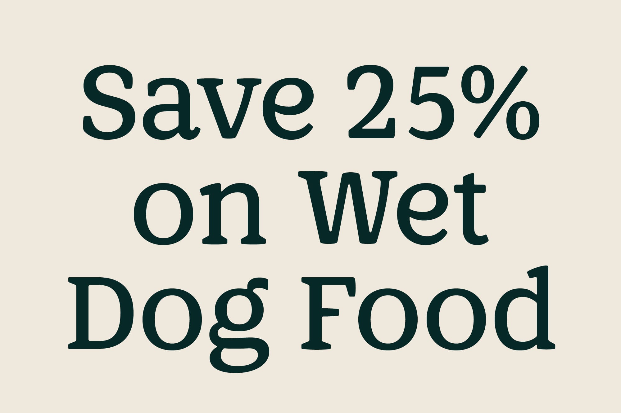
- Headline — Medium, SemiBold, Bold
- Coverage
- Adobe Latin 2
- Classification
- Serif display
- URL
- nomadstudio.com
- petsathome.com
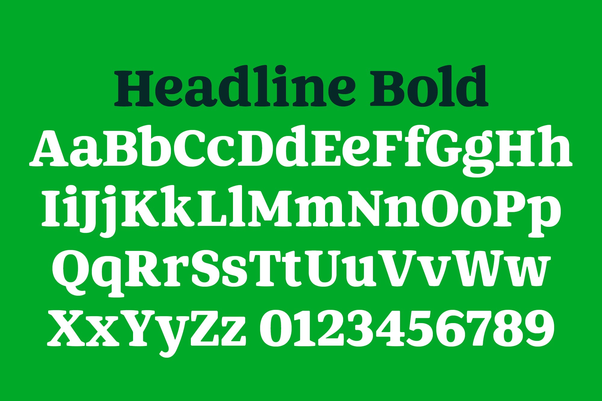
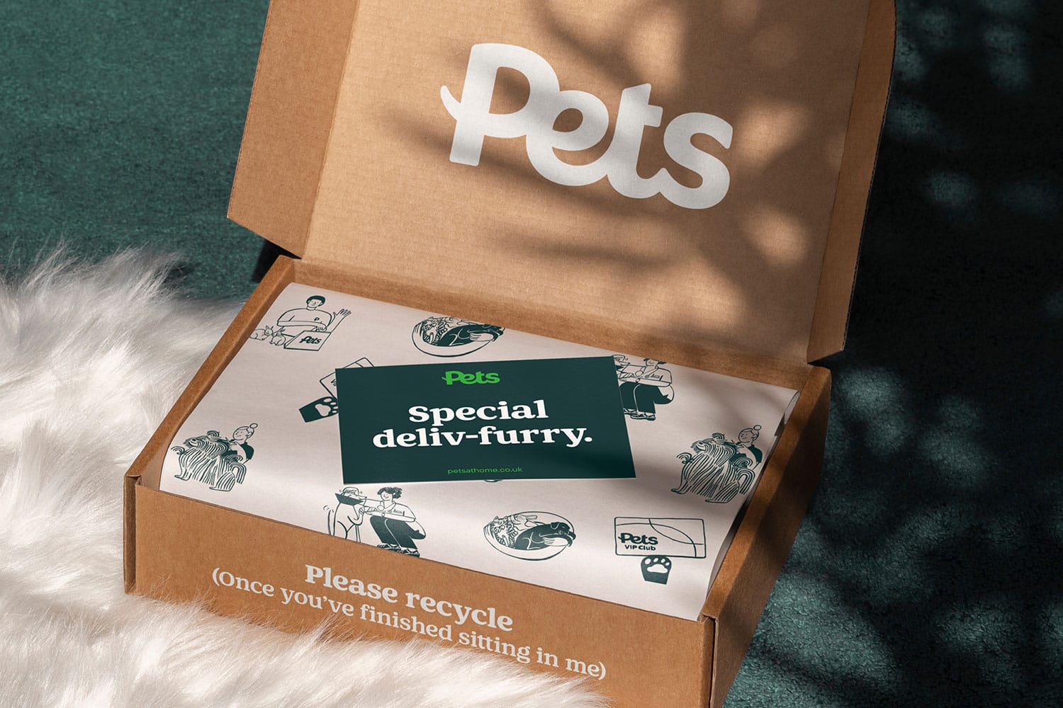
Working closely with Nomad Studio, Colophon created a succinct type system for Pets at Home that would not only cover their current usage but futureproof the brand for expansion. The collaboration included refinements to the logosite, the later addition of a supplementary sans serif sub-brand typeface in Regular to be used in specific lock ups, and the development of the headline serif typeface in Bold, SemiBold and Medium.
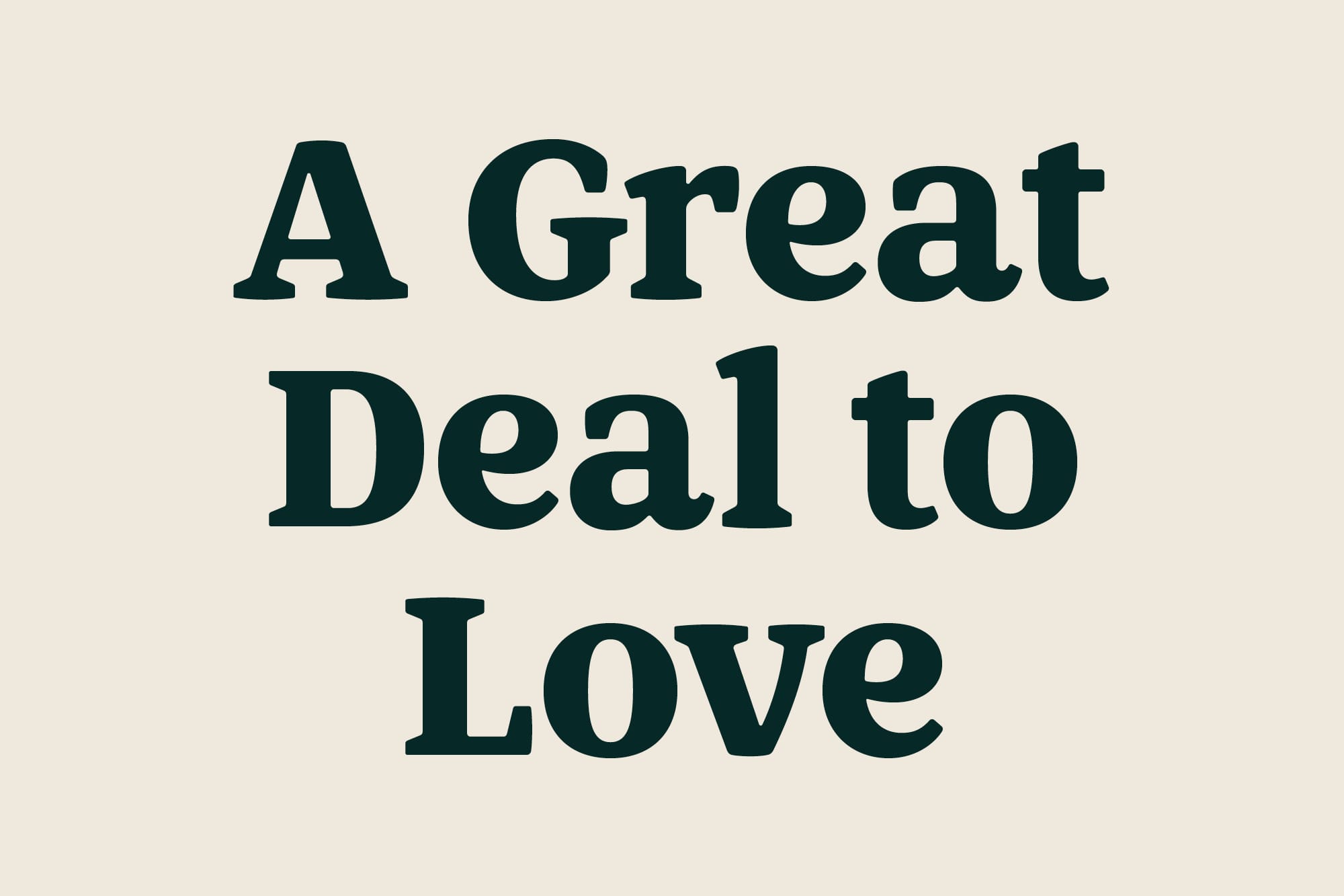
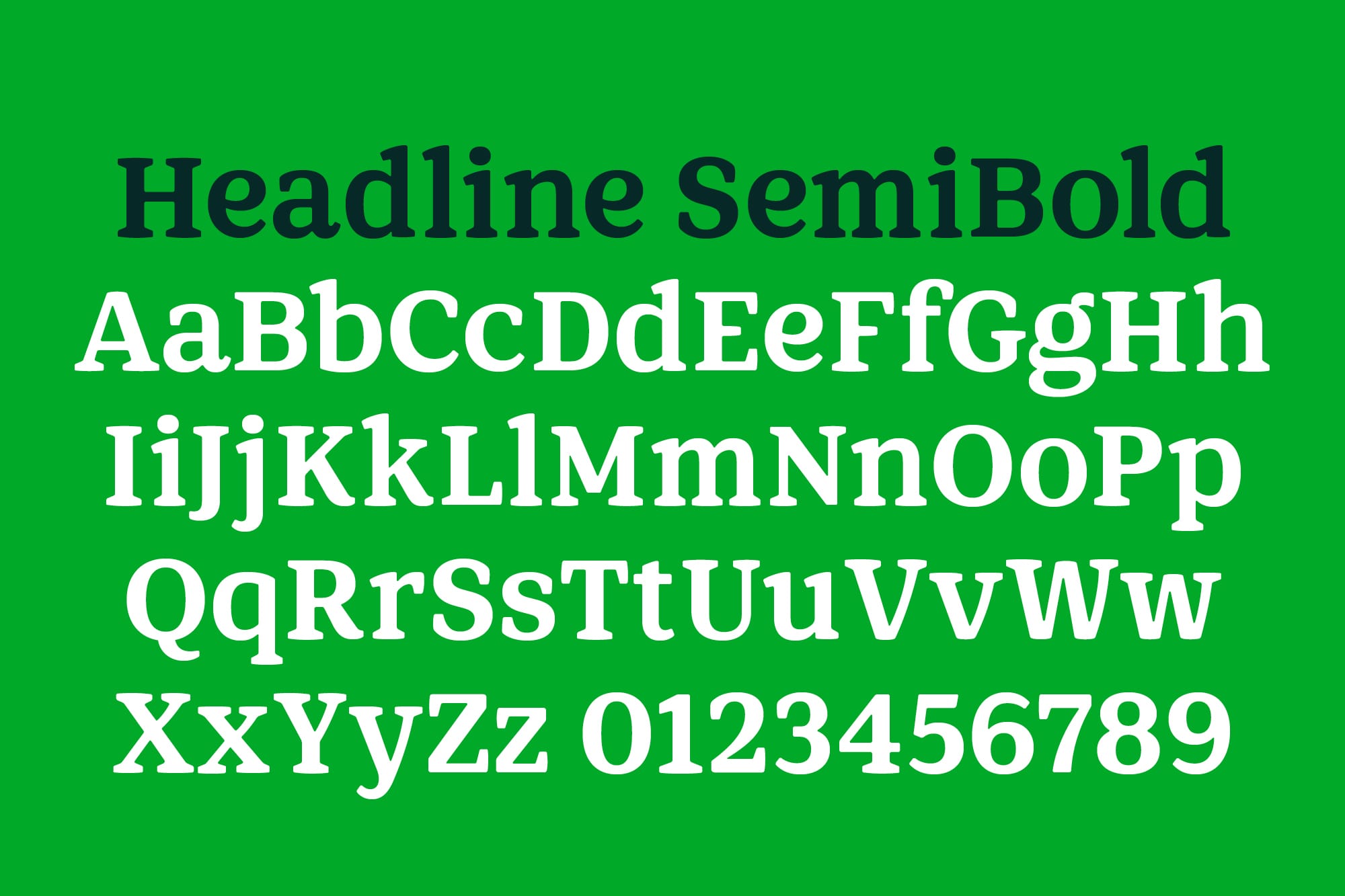
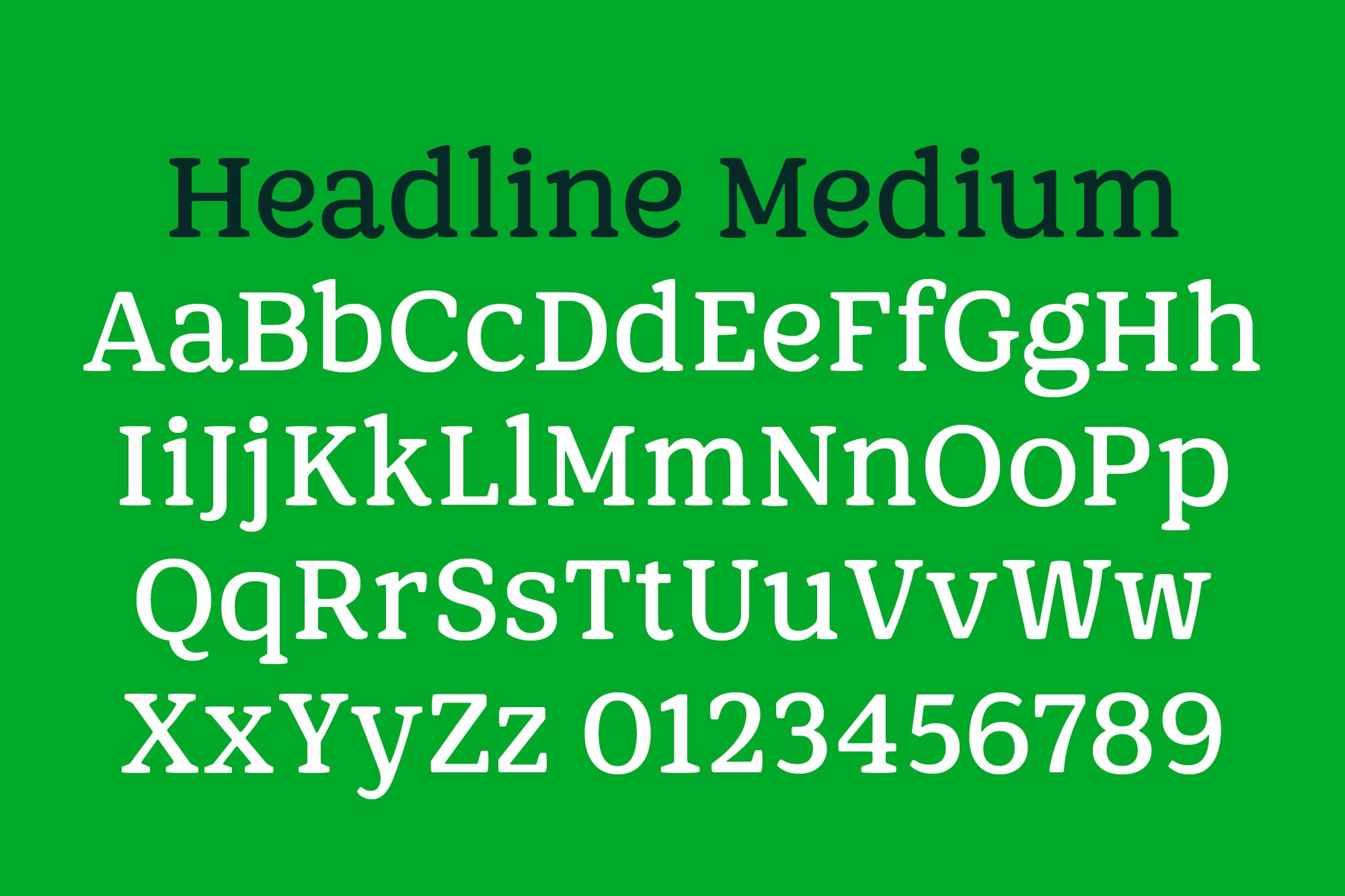
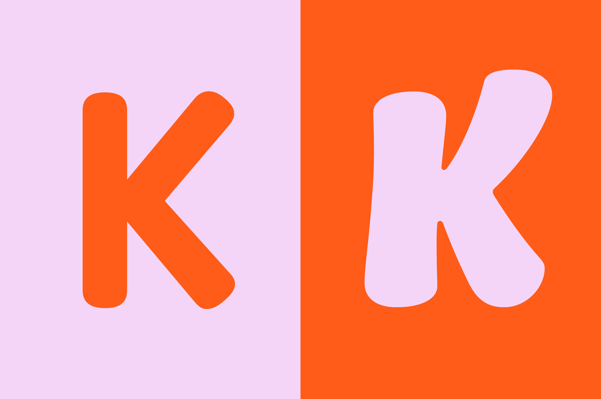
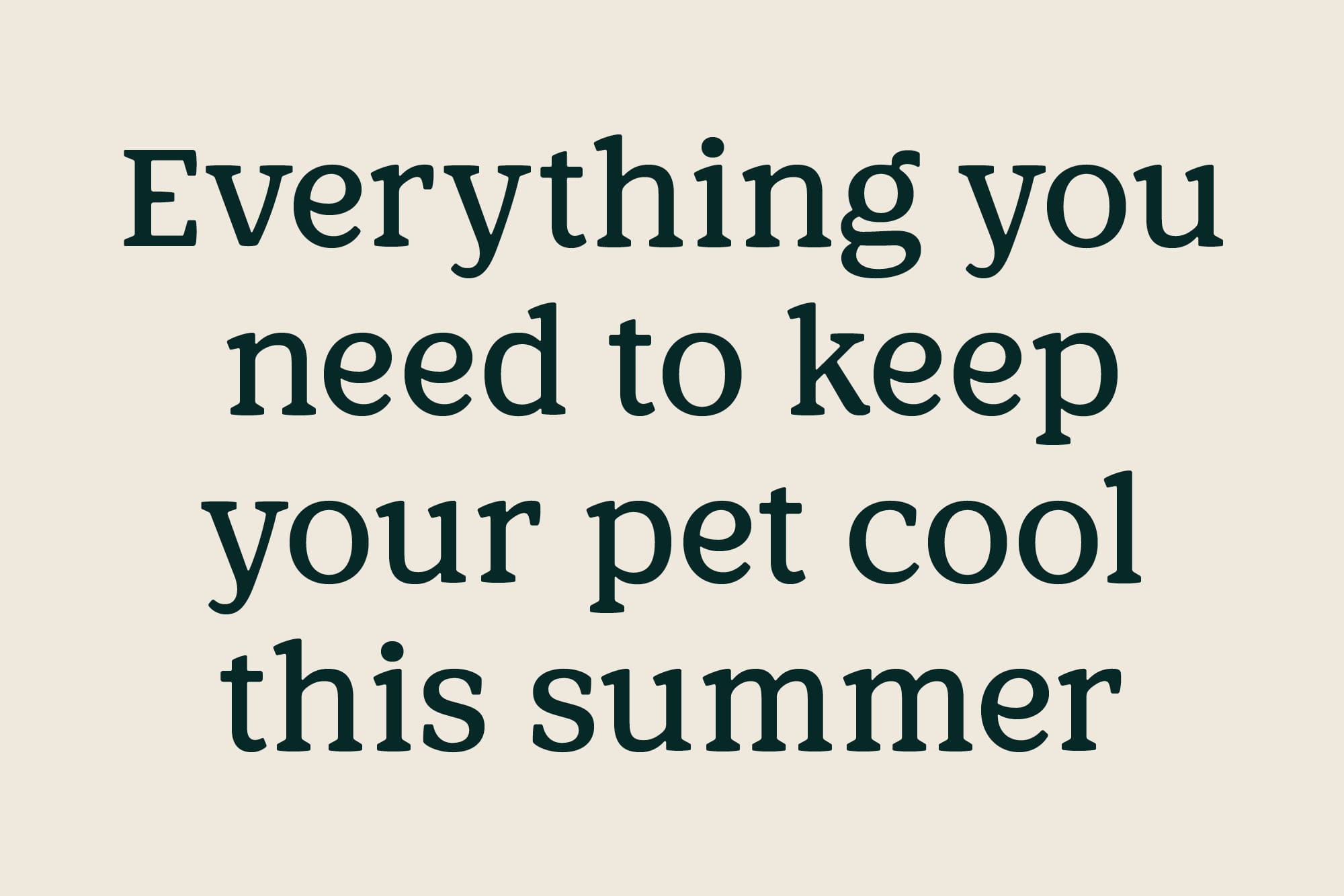
Pets Headline was designed to articulate a complimentary yet differentiated tone of voice alongside the logosuite, consisting of a core ‘Pets’ logo and derivative ‘Pets at Home’ and ‘Vets for Pets’ logos. Drawing on the authority of the serif forms, the three weight type family carefully balances a sense of trustworthiness with moments of expression and familiarity — an ethos that would characterise the entire rebrand.
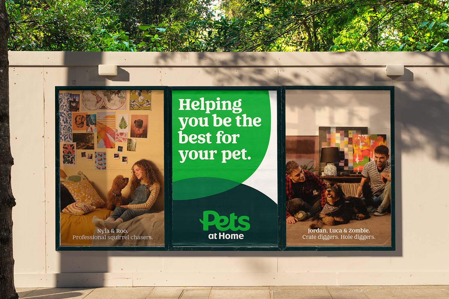
Thick and rounded bowed serifs, alongside curved, cursive-inspired characters such as the lowercase ‘e’, which takes inspiration from the Pets logomark, are toned down by no-fuss forms, such as the spurless ‘G’, ensuring that the tone of voice maintains its integrity and is fit for use across the myriad touchpoints of the Pets at Home brand package.
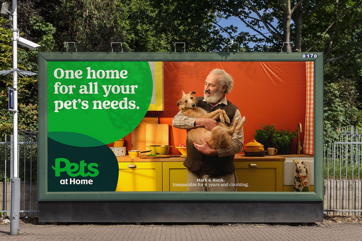
The headline type family became part of a pared back brand system that would centre around two shapes — one inspired by a human fingerprint and the other inspired by a pet paw outline, forming the basis of the new graphic imagery. This, combined with new photography and illustrations, unites Pets’ communications to create an instantly recognisable customer experience across their extensive brand offerings.

With thanks to Nomad Studio for the images.
Recent Custom Projects
View all