Who Gives a Crap
Founded in 2012 via a crowdfunding campaign, Who Gives a Crap is a 100% recycled, eco-friendly toilet paper, paper towels and tissue company that donates 50% of its profits to helping build toilets and improving sanitation around the world.
- Typeface
- Crapcase
- Comissioner
- Who Gives a Crap
- Year
- 2021
- Styles
- 5 Styles Text - 3 Styles Display - 2 Styles
- Coverage
- Adobe Latin 2
- Classification
- Sans Serif Display
- URL
- https://uk.whogivesacrap.org/
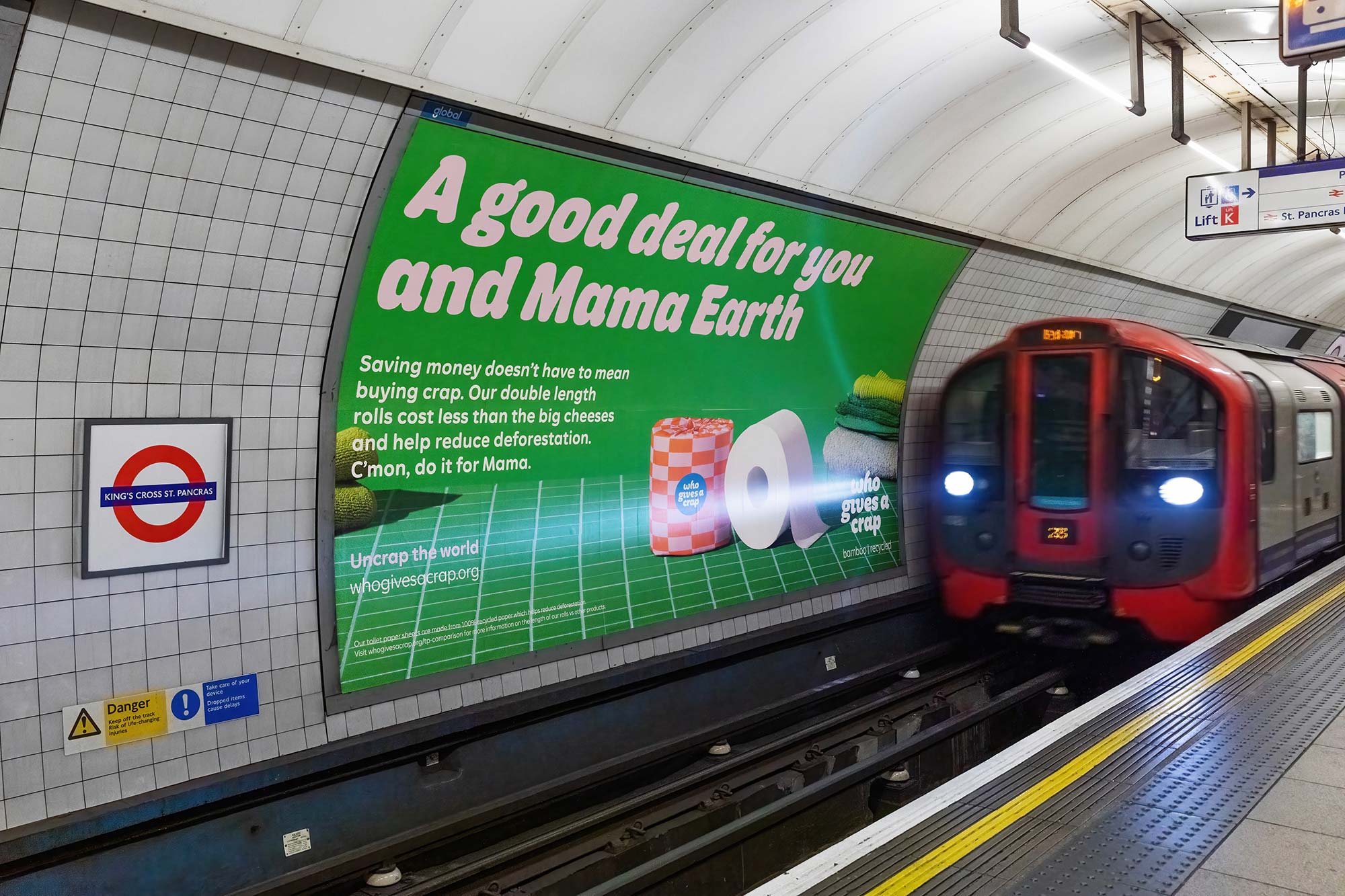
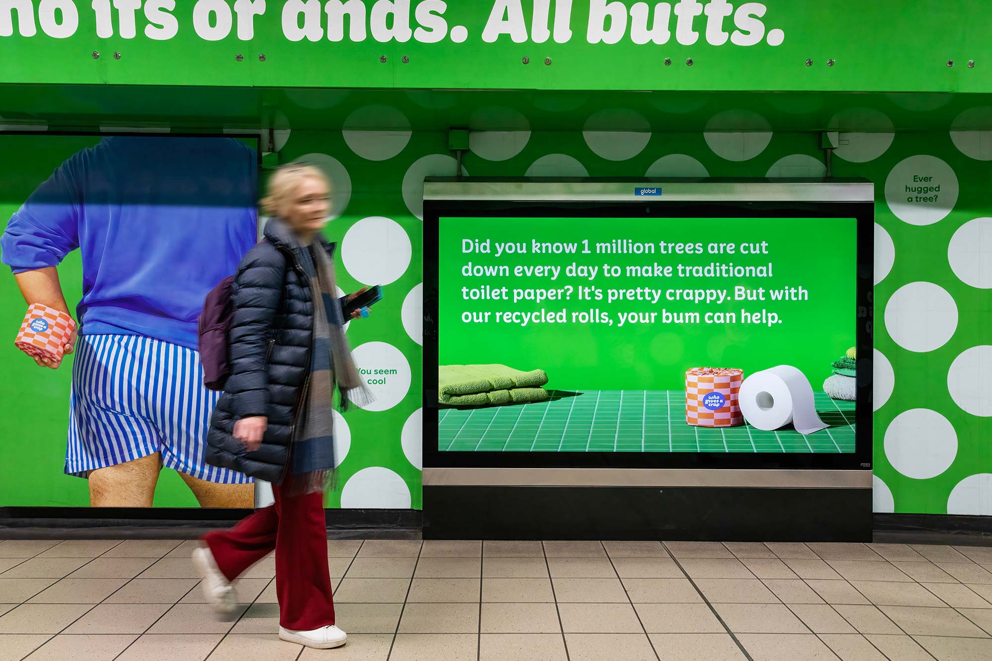
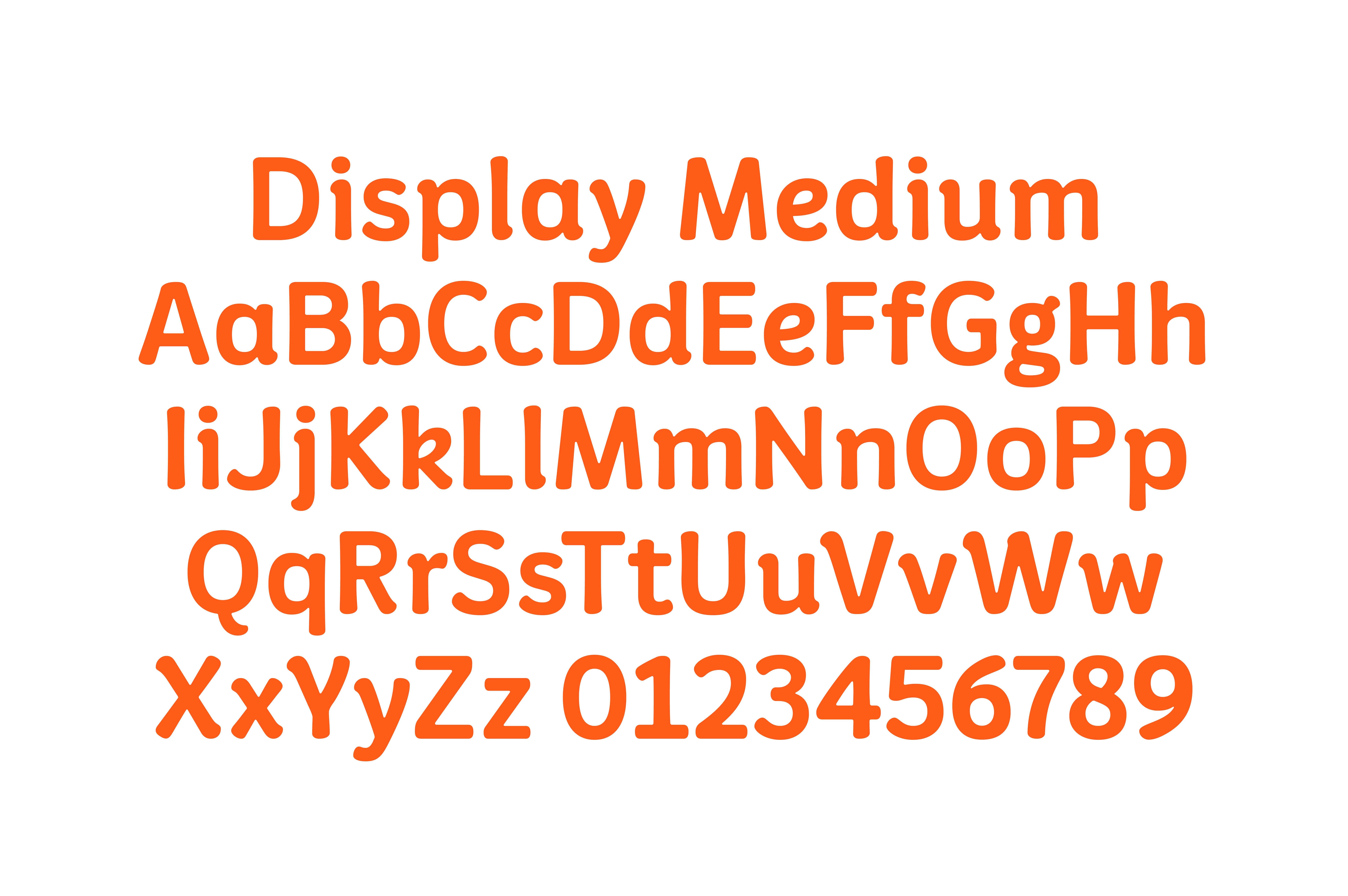
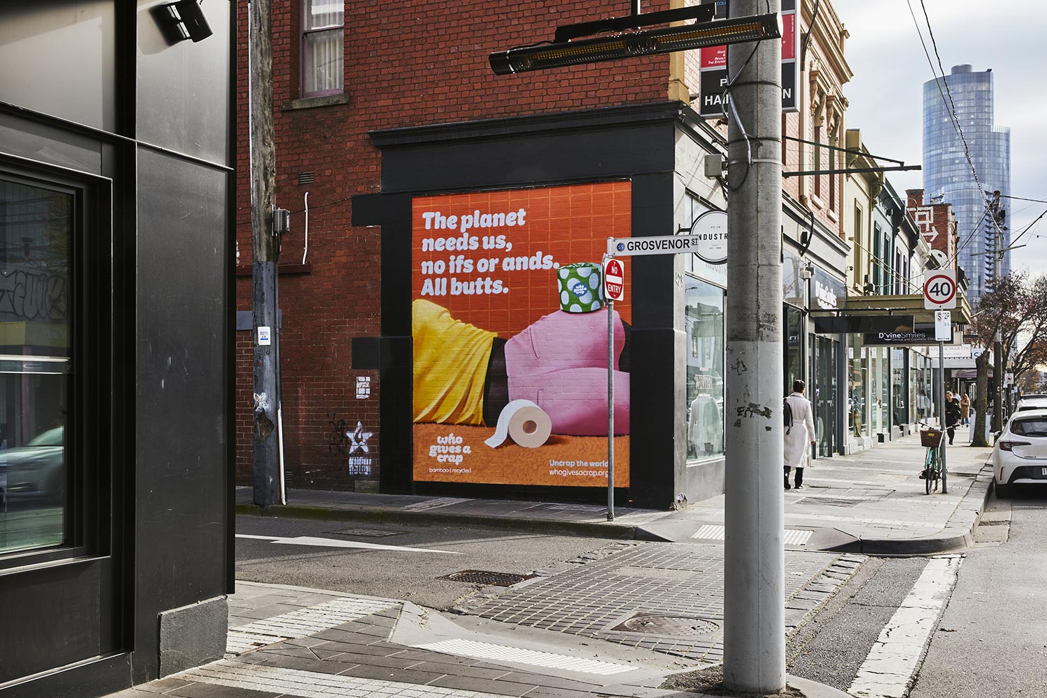
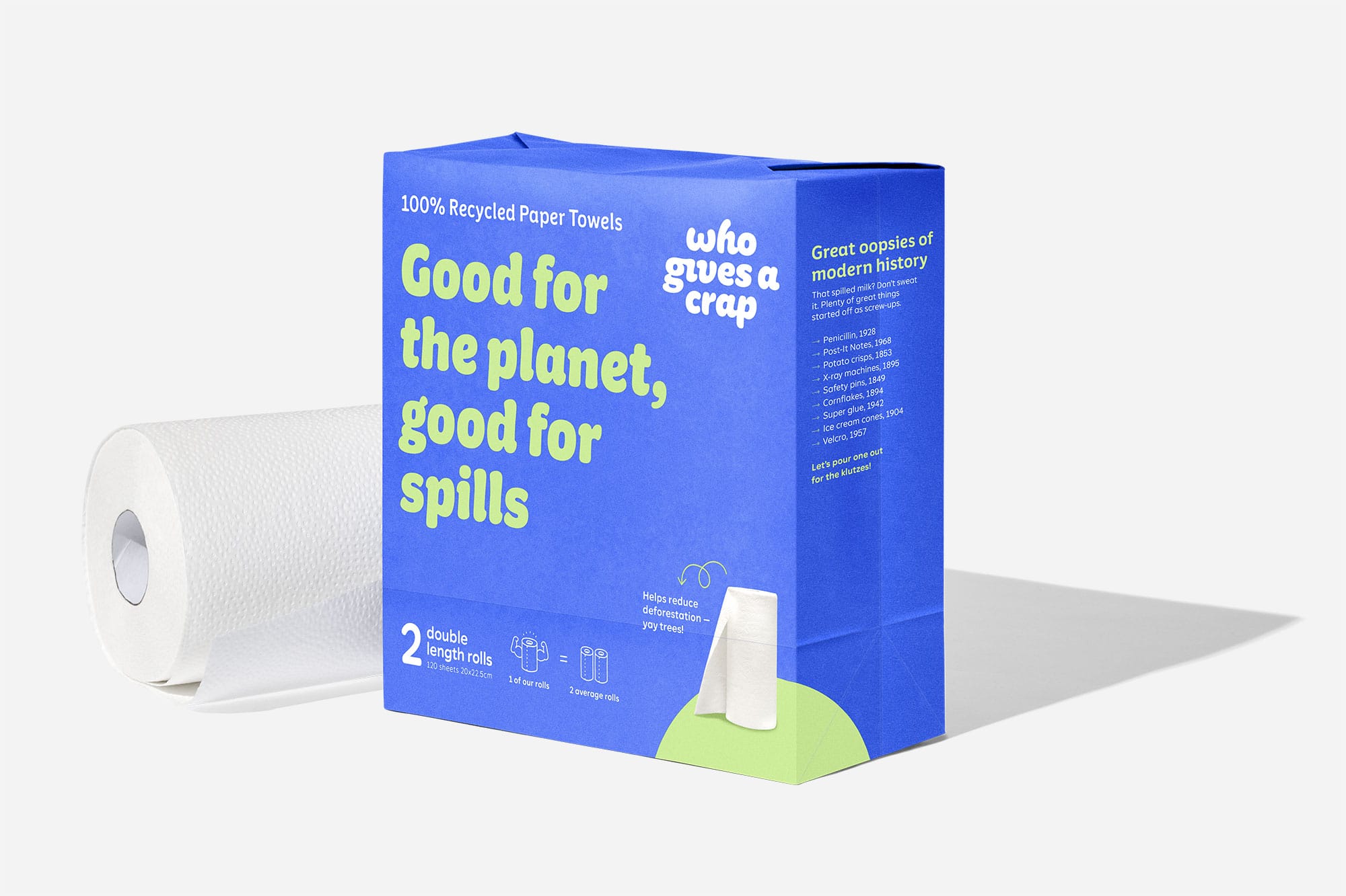
With already recognizable packaging, brand name and unique tone of voice, the 2023 rebrand focused on establishing the existing brand identity throughout the entirety of their visual design system by means of updated typography, illustrations and video. Two type families, Crapcase Display and Crapcase Text, create a type system that offers a visual connection between the already existing logo and the rest of the brand typography.


)
)
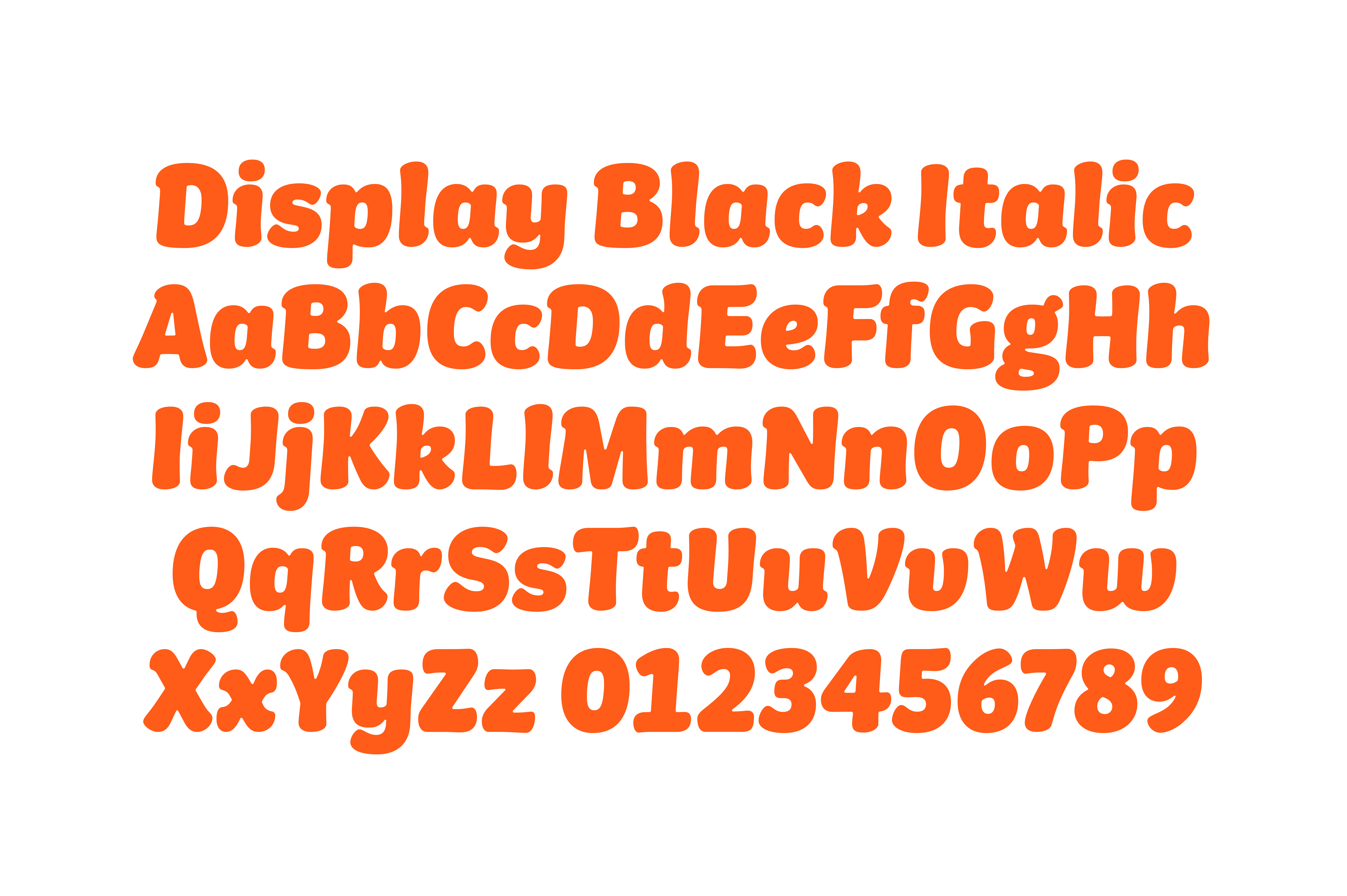
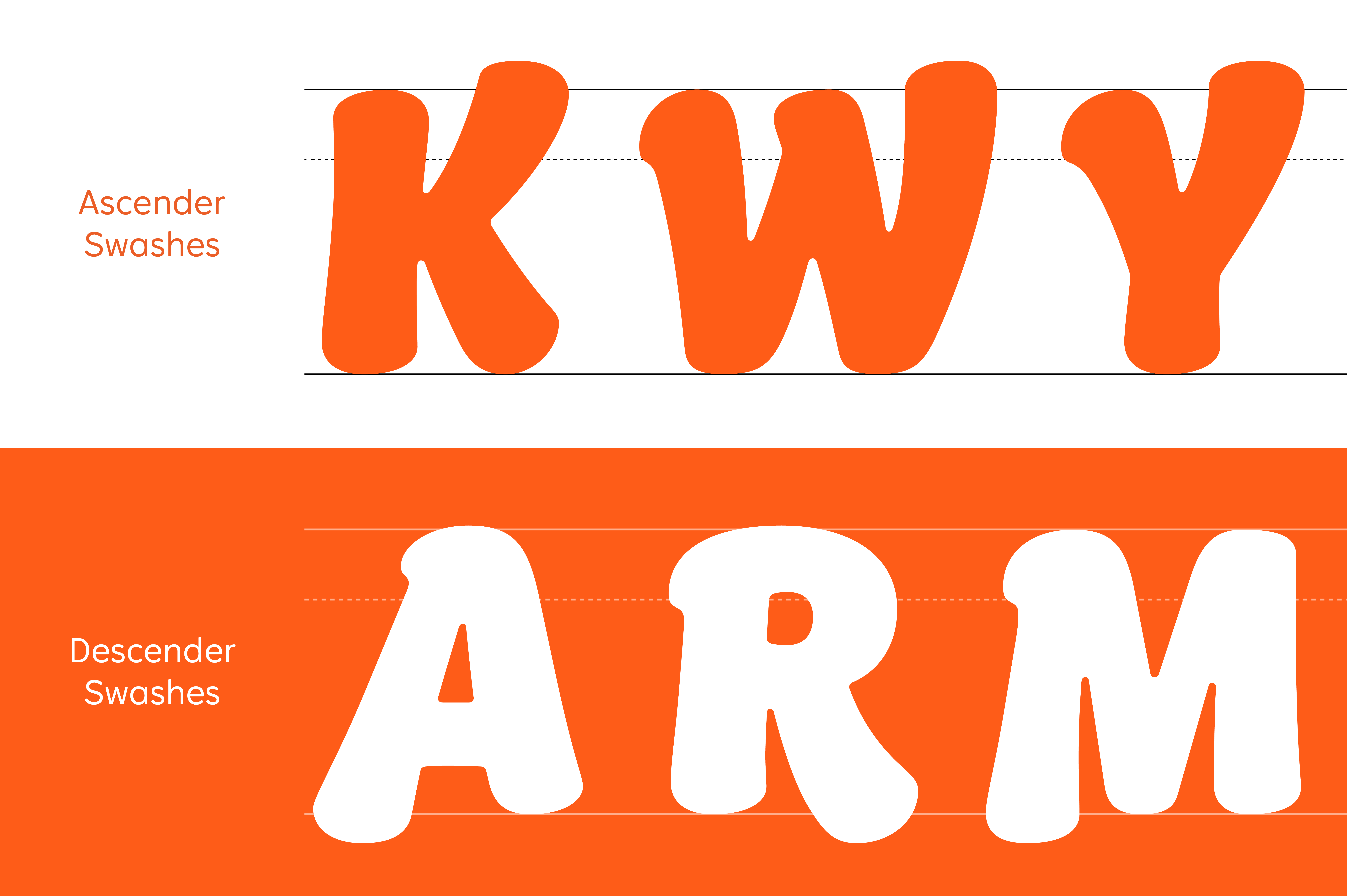
The type system is unique in that it is led by a Black True Italic Headline typeface that mirrors the 4º italic angle of the logomark. Crapcase Black Italic leans on a calligraphic influence inspired by the ligatures of the logomark, with entry and exit serifs and free flowing forms alluding to hand-drawing. Traditional True Italic features, such as a curved ‘e’ and directional ‘8’, and swash forms in the ‘v’ and ‘w’, are augmented in a series of alternate forms that amplify this already expressive behavior, with some lowercase forms like the ‘n’ and ‘m’ extending below the baseline.
Building on the Black Italic, Crapcase Medium takes the principles of the headline design and translates them into an upright style, maintaining some of the calligraphic traits of its parent in the form of serifed entry strokes. Designed for use in longer copy headlines, the Medium acts as an intermediary between the more expressive Black Italic and subsidiary Crapcase Text Family.
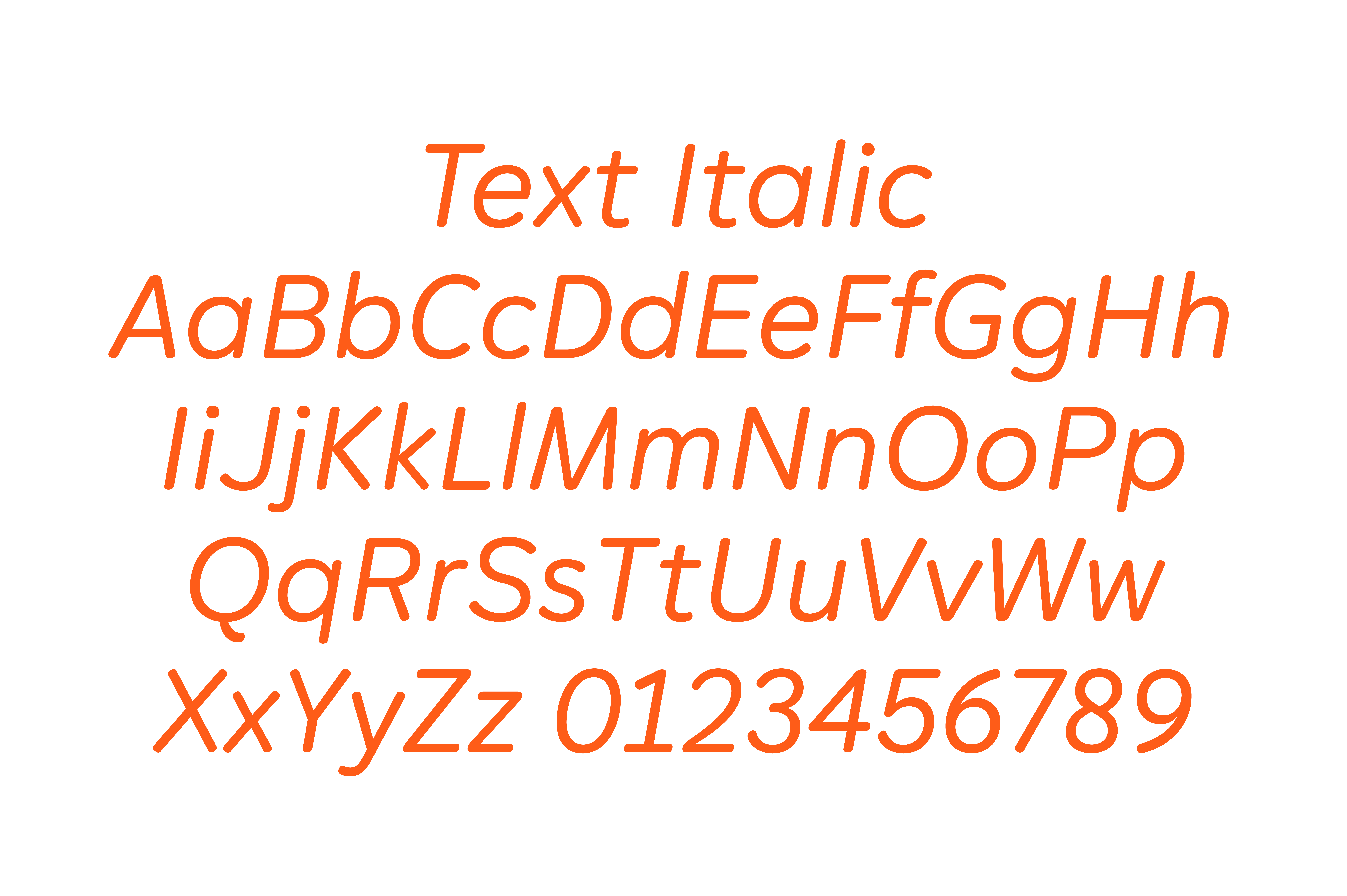
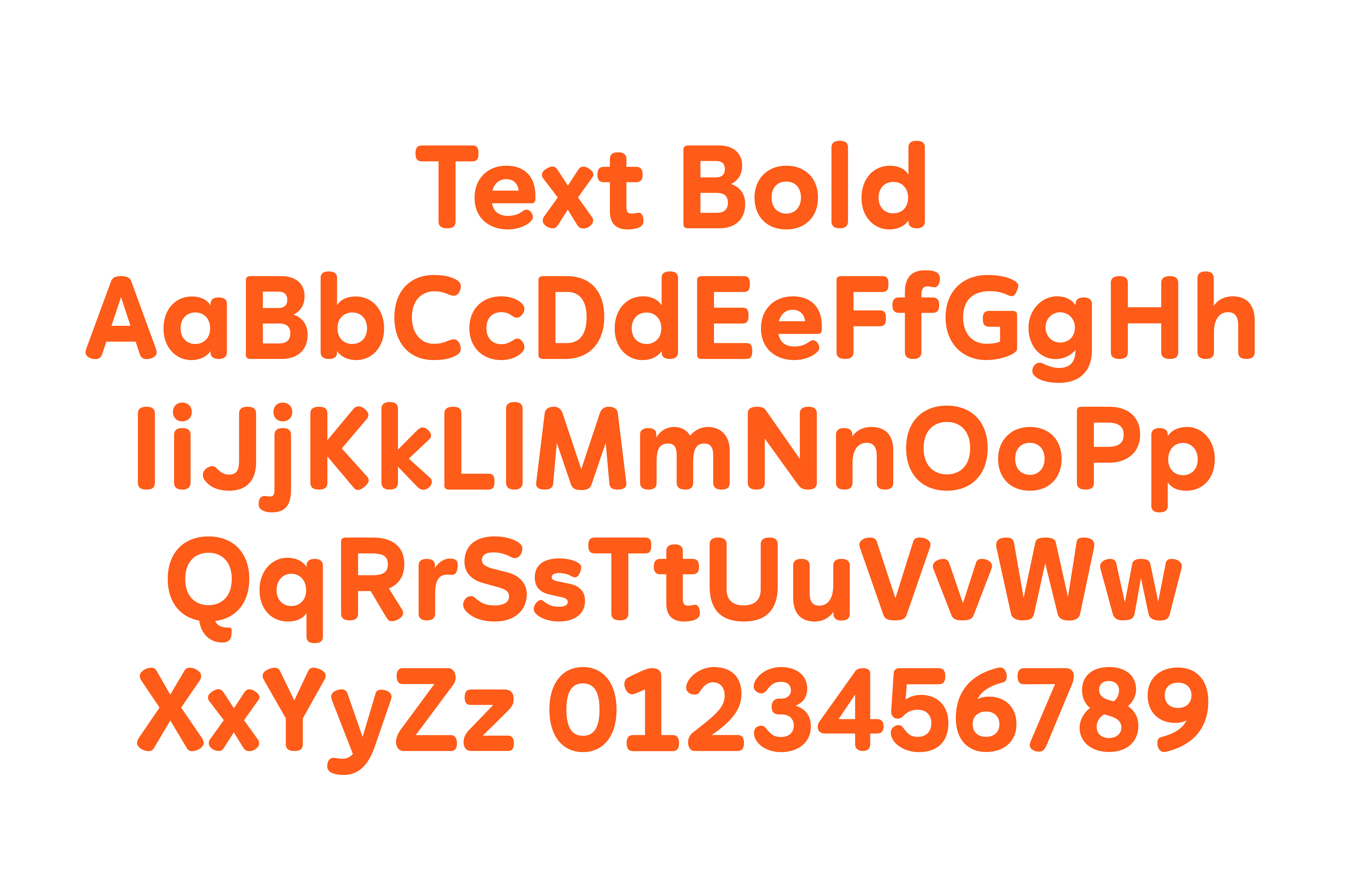
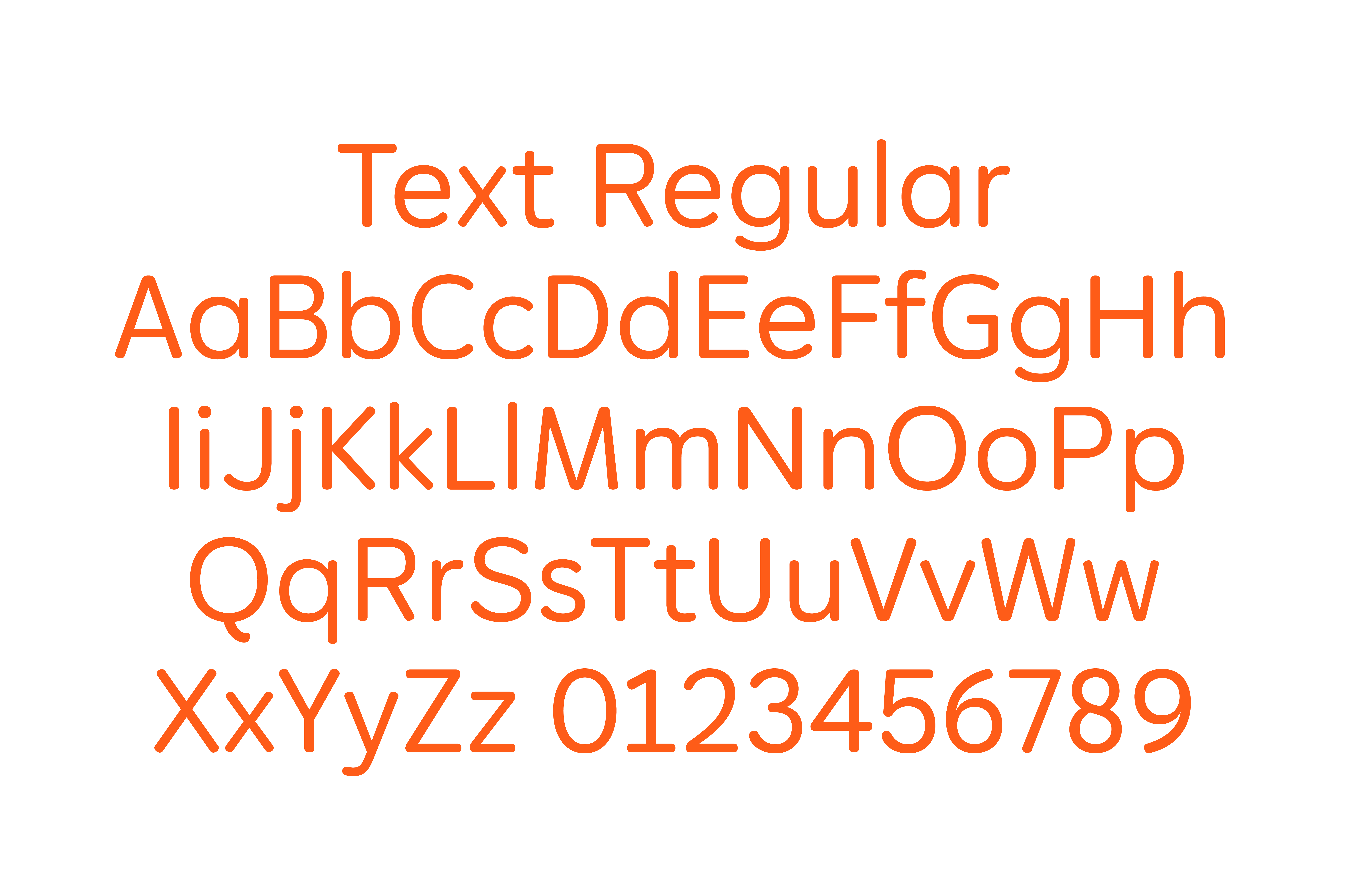
Crapcase Text, consisting of a Regular, Regular Italic and Bold style, tones down the personality even further into a simplified, rounded design. The contrast, which brings energy and movement into the display style, is reduced to an almost monolinear level, with simplified as opposed to gestural forms. Rather than following the system of the Headline style, where the 4º Italic references the slanted style of the logomark, the Regular Italic has an 11º tilt to give distinction from upright forms in body copy.


The rebrand would accompany Who Gives a Crap’s first global advertising campaign ‘Uncrap The World’, as well as a retail campaign that would see the brand become available in 240 Waitrose stores across the UK.
